Design System
React Component Library
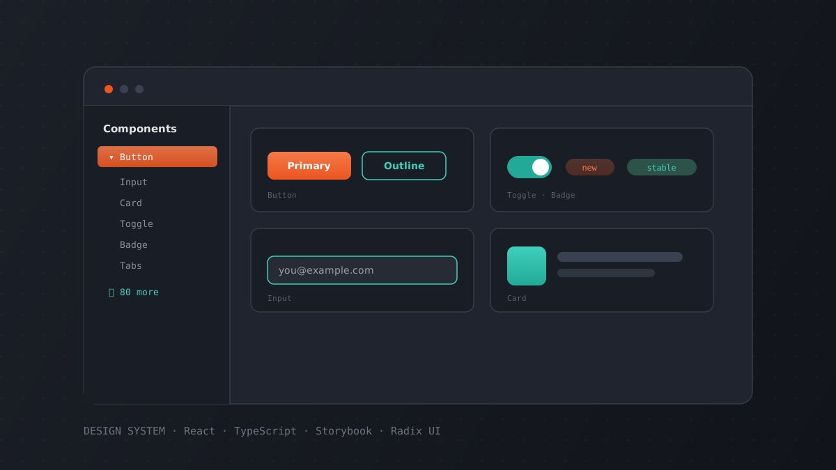
Comprehensive UI component library built with React, TypeScript, and Tailwind CSS, documented with Storybook.
— The problem
Multiple projects needed consistent UI components, leading to duplicated code and inconsistent user experiences.
— The solution
Created a shared component library with 80+ components following atomic design principles, fully documented with Storybook.
— Results
- 80+ reusable components
- Consistent design language across projects
- Interactive documentation with Storybook
— Stack
ReactTypeScriptTailwind CSSStorybookRadix UI